
Design System
Scaling Twik's product UI
A design system that improved consistency, reuse, and handoff speed.
Role
Design Systems Lead
Duration
6 months
Team
Design, Engineering, Product
Overview
Twik's product had scaled quickly, but the interface hadn't kept up in the same way. Similar patterns were being designed and built multiple times, handoffs were slowing down, and inconsistencies were starting to accumulate across the product.
I led the creation of twikUI, a design system designed to bring structure to that growth - helping designers and engineers move faster, make more consistent decisions, and reduce unnecessary duplication.
Product Context
Twik is a personalization and optimization platform for e-commerce teams. The product spans multiple surfaces and workflows, allowing users to configure and adapt their sites based on behavior, segments, and performance data.
As the product expanded, the UI evolved organically, which made it harder to maintain consistency and scale new features efficiently.
The Problem
The issue wasn't just visual inconsistency.
Different teams were solving similar problems in different ways. Components were duplicated, patterns diverged, and design decisions became harder to track and reuse.
Every new feature added more variation, more edge cases, and more friction between design and development.
Why It Mattered
This created real product impact:
- Slower design–development cycles due to repeated discussions and clarifications
- Increased QA complexity and risk of inconsistencies
- Harder onboarding for new designers and engineers
- A less cohesive experience for users
The product was scaling, but the interface was becoming harder to maintain.
Goals
What I Did
- Defined a modular component system in Figma aligned with real product use cases
- Mapped existing patterns and identified duplication across flows
- Standardized naming, states, and behaviors across components
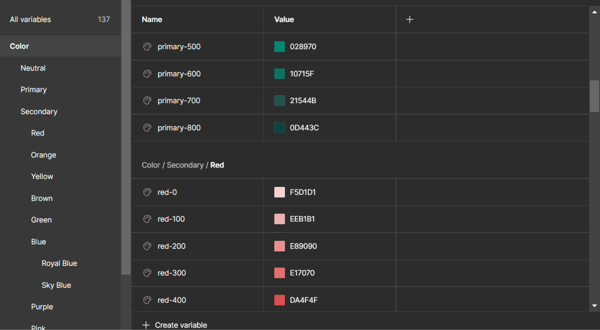
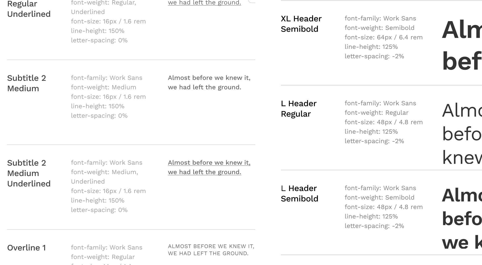
- Introduced design tokens for spacing, typography, and color
- Partnered closely with engineering to align implementation and edge cases
- Treated documentation as a product layer, not an afterthought
- Rolled out the system incrementally instead of a one-time migration
Key Decision
The biggest decision was to prioritize adoption over completeness.
Instead of trying to design a perfect, exhaustive system upfront, I focused on high-impact components that teams were already using. The goal was to create immediate value and make the system useful as early as possible.
At the same time, I avoided turning the system into a rigid constraint. It needed to guide decisions, not block them. That meant defining clear patterns while leaving room for edge cases and evolution.
This balance of structure without friction was critical for long-term adoption.
The Solution
twikUI became a shared foundation for how the product is designed and built.
It included:
The system was introduced gradually, allowing teams to adopt it as they worked rather than forcing a disruptive transition.
Outcomes
Design Consistency
Improved across products
Dev Handoff Time
Faster collaboration
Onboarding Speed
New designer ramp-up
Component Reuse
Reduced duplication
What I Learned
Design systems are not just about components.
The real challenge is creating something that teams actually want to use - something that reduces decision-making overhead instead of adding more rules.
Adoption depends on usefulness, clarity, and timing. The system has to meet teams where they are, not where you wish they were.
Gallery