
Onboarding
A clearer path to first value
A guided setup flow that improved activation and reduced time to value.
Role
Lead Product Designer
Duration
2 months
Team
Product, Design, Customer Success
Overview
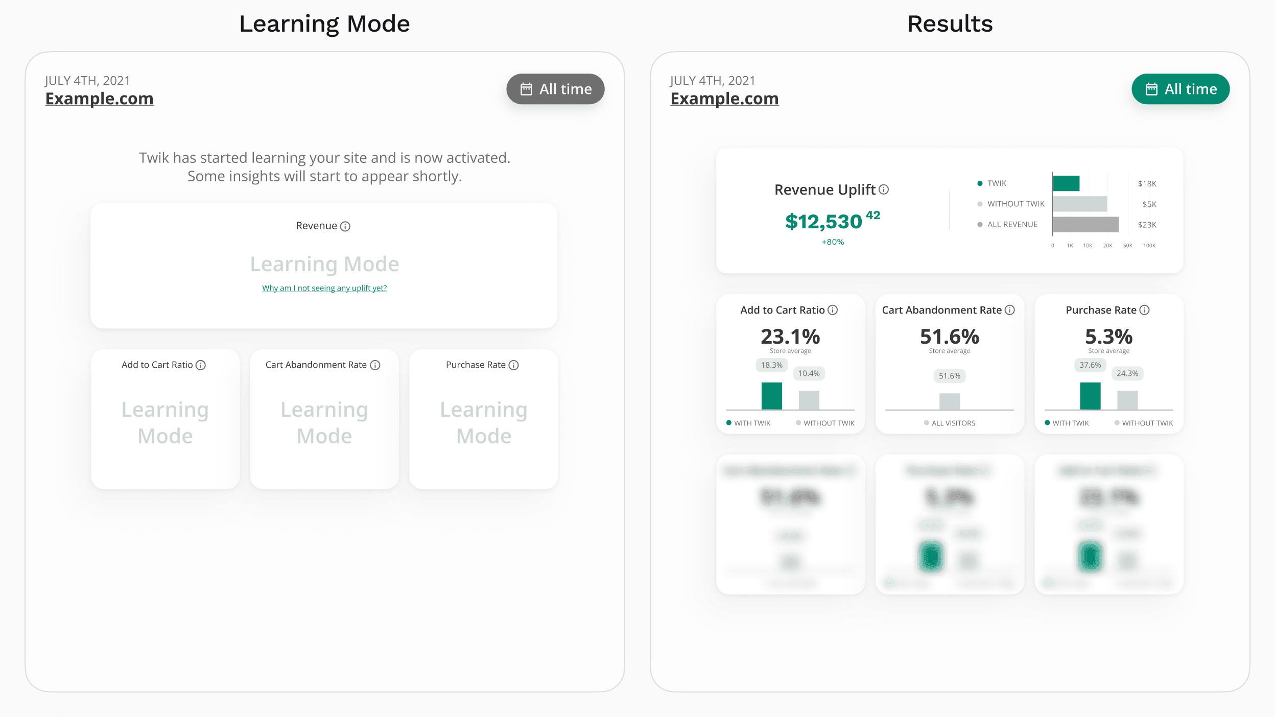
New users were dropping off before experiencing Twik's core value.
The onboarding process was technically complete, but not particularly usable. It asked users to configure multiple steps without clearly explaining progress, impact, or what they were working toward.
I redesigned onboarding as a guided path focused on clarity, momentum, and early value - helping users understand what to do, why it mattered, and how close they were to getting results.
Product Context
Twik is a personalization platform that requires initial setup before users can see meaningful results.
Users needed to define rules, connect data, and configure behavior, but the existing onboarding treated this as a checklist rather than an experience.
The Problem
Onboarding felt like a wall of configuration.
Users were presented with multiple steps, but without a clear sense of progress, priority, or outcome. It was difficult to understand what mattered most, what could wait, and how close they were to being done.
The experience was functional, but not motivating.
Why It Mattered
This directly impacted activation and retention.
- Users dropped off before completing setup
- Time to first value was longer than necessary
- Many users never reached the product's core experience
- Early confusion reduced long-term engagement
The product required onboarding, but onboarding was blocking the product.
Goals
What I Did
- Mapped the full journey from signup to first value
- Identified friction points and drop-off moments
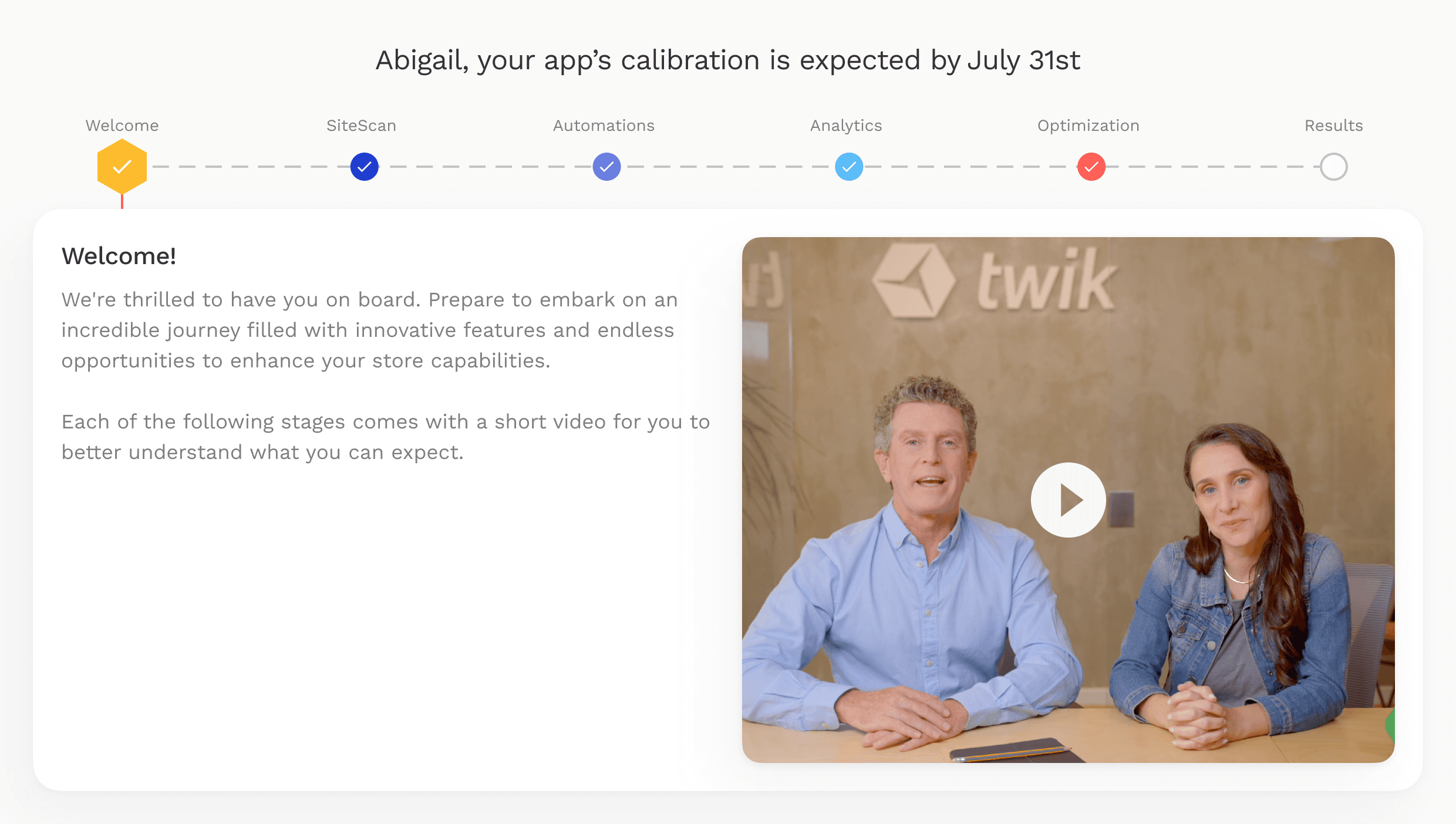
- Reframed onboarding as a step-by-step guided flow
- Introduced a clear progress system with milestones
- Designed contextual guidance instead of generic explanations
- Added personalized elements to make the experience feel relevant
- Created moments of feedback and celebration to maintain momentum
Key Insight
The issue wasn't that onboarding was too long.
It was that users didn't understand where they were or how close they were to getting value.
Key Decision
The most important decision was to make progress visible.
Instead of presenting onboarding as a set of tasks, I designed it as a path. Each step had a clear purpose, a clear next action, and a sense of movement toward something meaningful.
This reduced uncertainty and helped users stay engaged throughout the process.
The Solution
The redesigned onboarding focused on clarity, guidance, and momentum.
Key improvements included:
The experience shifted from completing tasks to moving forward toward value.
Outcomes
Completion Rate
Setup finished
Time to Value
Faster activation
Day-7 Retention
Users returning
Activation Rate
First campaign created
What I Learned
Onboarding is not just about setup.
It's about building confidence early.
When users understand what's happening and feel like they're making progress, they're much more likely to continue and reach value. Clarity and momentum matter more than reducing the number of steps.
Gallery